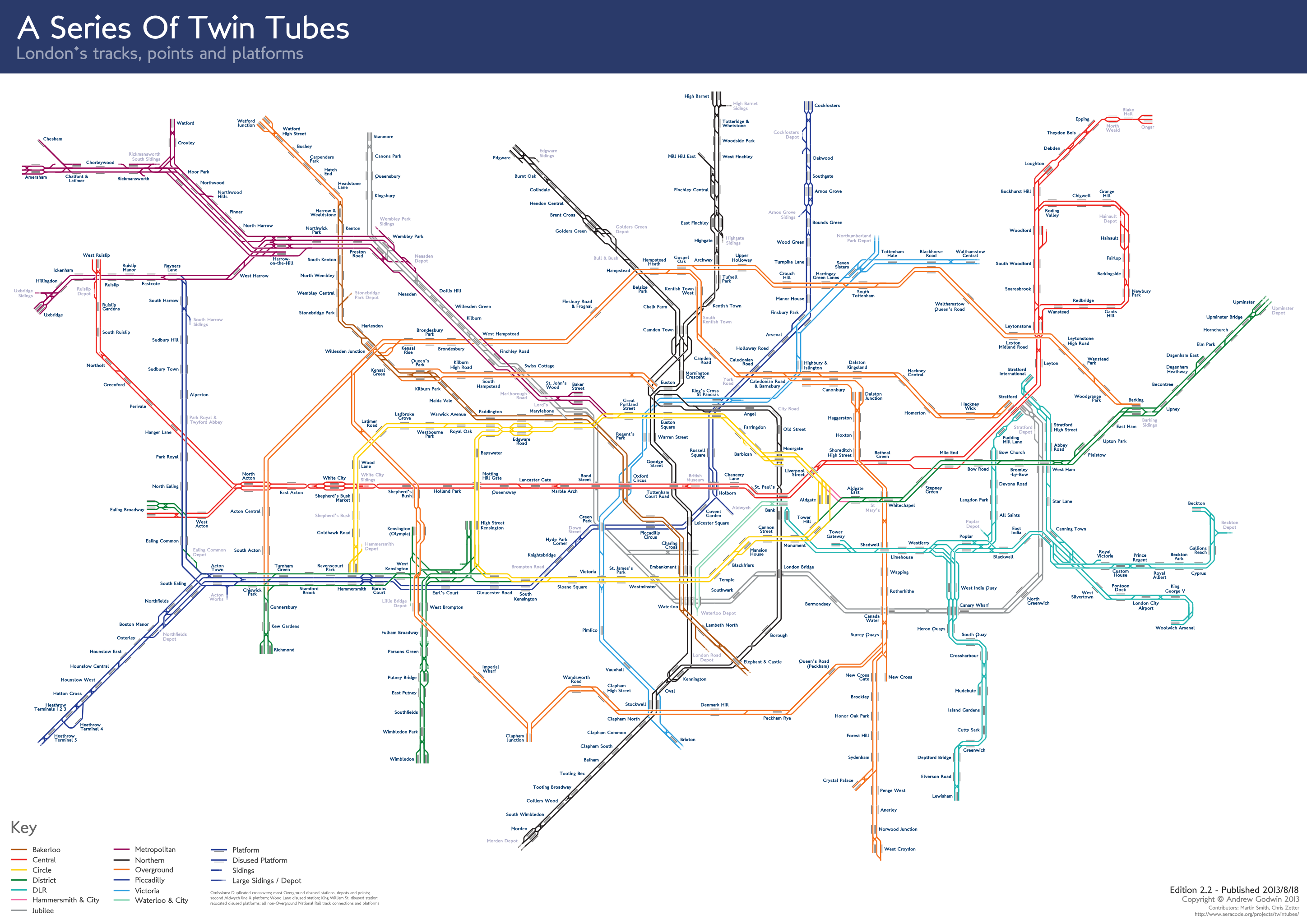
The Tube map has helped define London - particularly to the many new migrants... But it is only one way of seeing. look a bit deeper and the perspective on London Landscape changes (see list of maps below)
Reprinted from http://londonist.com/2013/01/alternative-tube-maps-circles-within-circles.php...
It’s often said that, elegant though the Tube map is, it’s getting
increasingly cluttered as more lines and stations are added. Crossrail, the
extension of the Northern Line, and the reintroduction of Thameslink will one
day make matters even worse. So various attempts have been made to redesign the
geometry (not least, our own stab at a 3-D version). This reworked
map from Jonathan Fisher
is the latest example. Like earlier efforts by Francisco
Dans and Maxwell Roberts, Jonathan has dispensed with Harry Beck’s
original angles, introducing curves and circles into the diagram.
Jonathan tells us about his inspiration and methodology:
The idea was to create a map that made clear the new orbital route created by
the Overground connection from Surrey Quays to Clapham Junction — to make these
stations and the line itself feel simple and like a part of central London
rather than a tangled complicated suburban line.
I liked the very simple idea of an inner circle line
and an outer circle oribital line, and making these two circles have a
simple relationship to one another, and I also liked the idea of making the
centre of the circles the centre of London. The Moscow subway map starts from a
similar principle and I like that level of clarity.
I started with this simple diagram of a small circle
inside a large circle with the centre of London in the centre and then tried to
make the rest of the map work around this. It admittedly creates some geographic
peculiarities but I don’t mind this, its only a diagram, and primarily I was
trying to create a beautiful clear diagram, not a geographically true one. What
I always find strange about the current tube map is that it makes a half hearted
effort at geographical accuracy but it actually isn’t true at all, its
very misleading. Visitors to London believe that it’s nearly true, but its not.
I like the way this map doesn’t pretend it has any geographical honesty, it is
purely diagrammatic.
Also, I liked the way that by removing the Thames, and making London feel
contained by a clear circle (the Overground), there is no distinction between
north of the river and south of the river. London feels whole.
Ultimately, it would be nice to see more concentric
circles in the diagram (i.e. more around London routes). These would
make travelling to the centre of London less important and (hopefully)
strengthen suburban identities.
The map certainly looks impressive and attractive, and includes the
Thameslink route currently absent from the standard Tube map. Like all similar
efforts, though, it does have its downsides. Chief among them is the dense
central section, which would be difficult to read on a pocket-sized Tube
leaflet. The elongated line interchanges — most notably at Bank and King’s Cross
— might also jar with some people.
Other alternative "Tube" maps